Even as most of us are still bundled up in winter coats and gloves, the fashion-savvy it’s already time to start educating ourselves about the new fashion trends for spring. The new pieces are arriving in stores and display windows even now. What pieces can you keep and update with a trendy accessory? What absolutely requires an updated replacement?
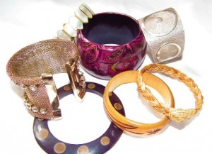
One of the easiest ways to begin evaluating your current wardrobe versus exciting—and possibly expensive—new fashion trends is to take a look at the “new” colors emphasized on the runway. Instead of overturning your entire wardrobe, though, consider incorporating accessories like bracelets, scarves, necklaces and even shoes into your closet to keep it current.
2013’s New Colors
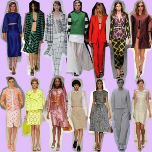
Unlike previous years’ easily described pastels or neons, the colors of 2013 include dynamic brights mixed with unusual neutrals and also new, lighter shades too powerful to be called pastel. “This season’s color palette emphasizes the need for balance, while at the same time allowing for individuality, self-expression and excitement,” explained Leatrice Eiseman, executive director of the Pantone Color Institute. Use Elseman’s quote to justify your new color combinations and pairings of the old and new.
· Greens
Appropriate for the season, a range of greens is prevalent in designers’ collections. First, there’s Pantone’s Tender Shoots shade, a mix of a light yellow with a pale lime green. The color combination is almost neon—but not quite—and provides a significant degree of power to a piece despite its gentle shade. A second green common to this season’s collections is known as Grayed Jade. Unlike the muddy mix you might imagine, it’s in fact a more subtle, lighter hue. Finally, the most vibrant of the spring greens is that of Emerald, described as sophisticated and radiant.
· Blues
The new blues of spring have nothing to do with a down mood and everything to do with the range of shades you might associate with a summer day at the beach. Dusk Blue is the shade of a child’s crayoned ocean: a light to medium tone with its slight potential for brightness just barely held in check with a very slightly gray undertone. The much darker Monaco Blue is a navy blue infused with a purple tint that allows it to serve as the foundation of an outfit, if necessary. In between these two blues is a light but corporal African Violet shade—almost like lavender with muscle.
· Whites
Get ready for white, a lot of it and in almost every type of garment. The crisp, clean white of 2013 is less a neutral shade to provide contrast against a color, and more of a stand-out shade on its own. Designers have played with white to demonstrate two huge fashion trends of the season: laser cut-outs of the primary white fabric for a peek-a-boo effect and the sheer craze that teases the eye with pretend exhibitionism. Pantone’s Linen hue most likely stands in as the light neutral of the color family as white holds court on its own.
Ready for the Change?
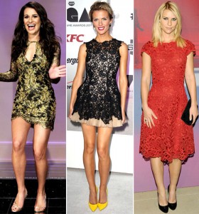
After a few seasons of color blocking bright neons against seemingly incongruous shades of deep intensity, the hues of 2013 seem fresh, fun and gentle to the eye. There’s still plenty of power to be had in the new Poppy Red and Nectarine shades; they just don’t have to be worn together to catch the eye and keep up with style.
